There are many reasons why Clicker 7 is a fantastic tool for supporting learners with dyslexia.
In this post, I’m going to explore some of the visual changes that you can make to Clicker.
Some pupils describe various difficulties when trying to read text on a screen. Text can appear in-motion (vibration) or compressed. Individual letters can be difficult to distinguish. Those with tails (such as ‘y’,’j’ and ‘g’) are problematic. Similarly-shaped letters, or those that are reflections of each other (like ‘b’ and ‘d’) can also present challenges.
Many learners with dyslexia have colour overlays or coloured glasses to assist them while reading. Black and white text has long been considered a poor choice for certain learners. Recent research has given additional credibility to this intervention by suggesting that dyslexia is primarily a visual learning difficulty.
You can address all these issues with Clicker 7 by adjusting the ‘Accessibility’ settings (found on the ‘Options’ ribbon).
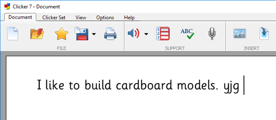
In this example, you can see the standard Clicker settings with the Sassoon CR font in black, on a white background. Learners with dyslexia may struggle to read this:
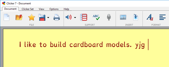
In the second example, we have changed Clicker to use custom display colours and selected the ‘Dyslexie’ font, which is included in Clicker 7.
You can see that the letters are much easier to distinguish in the second example – the ‘d’ and the ‘b’ are more distinct from each other and the tails on the ‘y’, ’j’ and ‘g’ are very different.
The font itself is heavy-based and loosely spaced – this helps to combat vibration and compression.
To watch a video I’ve created this topic, please click here.

